2026-04-19 Technical Tutorial: Using QGIS for fantasy maps
I have used QGIS in the past to create maps for fantasy roleplaying purposes. It is a total overkill, if you want to create a local area map. But you can have a lot of fun with it on a grander scale. For example, you can export results from Azgaar’s Fantasy Map Generator to QGIS to create nicer looking maps. Lemuria Games made a great tutorial on that for YouTube: Fantasy Map Tutorial.
The most excellent Idraluna Archives has made A Tutorial for Making Hexcrawl Maps in QGIS and a series on Mapping Fantasy Antarctica which have renewed my interest in doing something with QGIS. Since Idraluna Archives already covers using real world data to create maps for elfgames, I want to focus using procedurally generated elevation data as a basis.
In this tutorial we will be making a pretty topographic map of the overall planet and generate a regional hex map for a region of interest. This involves three steps:
- Procedurally generating a heightmap, a biomes map, and some colorful maps,
- importing everything into QGIS, and
- using QGIS magic to generate a regional hex map.
I assume you know how to install programs on your operating system and how to run programs from the command line.
Torben Æ. Mogensen’s Planet Generator
Torben Æ. Mogensen’s Planet Generator is an excellent tool. I believe I found it via donjon. The tool is fairly well documented, so I encourage you to read the manual and play around with it yourself! Here we will be using the planet generator to create a height map, generate a biomes map, and to generate some colorful images of our planet.
To generate your first map, simply type
planet -o <filename>
The generator outputs a bitmap file named <filename>, which can be
converted to a compressed image file if needed. However, it generates a
different map every time the generator is invoked, the default color
scheme looks way too bright for my taste, and the image is probably too
small to be useful later.
The first thing we want to do is to generate the map using the same
random seed every time. I found the best way to find a seed is to use
the generator’s Web
Interface. Just hit random
until you find a seed you like. I liked 10606208 a lot, and we will
be using this seed as an example moving forward. It even has the
stereotypical fantasy continent in the North East!
To use your seed, run the generator with the -s <seed> flag.
However, for the commandline tool, the seed it is a floating point
number between 0..1. If we use the seed generated by the web
interface, we have to add 0. to make it a number in the range
0..1, like so
planet -s 0.10606208 -o <filename>
We now generate the same planet every time.
Generating a color map
To change the colors of our map, we can use the -C <color map> flag
using one of the provided color maps. I never liked the color maps
provided by default too much (except maybe mars.col), so I wrote my
own based on color gradients I found on
cpt-city:
Just copy these into the folder you run the generator from. To use the Colombia color gradient, for example, use
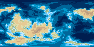
planet -s 0.10606208 -C Colombia.col -o <filename>
Looks rather pretty, doesn’t it? The map is still quite small,
however. By default, the generator outputs an 800x600 pixel
bitmap. We should generate a bigger map. We should also use a
different projection moving forward.
The generator creates a heightmap on a sphere and squishes (yes, that’s a technical term) that heightmap into a plane using a projection. I’d love to tell you more about projections, but I’m not that guy (of course, xkcd has a comic on that topic). By default, the generator uses the Mercator projection, which is the most commonly used projection for world maps, at least in the Western world. Moving forward, we want to use the Square projection, as the generator calls it, which is also called equirectangular projection or plate carrée, pardon my French.
To change the projection, we use the -p<projection> flag, where a
letter indicates the projection we want. Note that the letter
immediately follows the flag! For square projection, the letter is q,
so we type
planet -s 0.10606208 -C Colombia.col -pq -o <filename>
To generate a bigger map, we can use the -w <width> and -h <height> flags to set
the width and height of our image. The square projection has a ratio
of 2:1, so you want your <width> = 2 × <height>, for example 7800x3600:
planet -s 0.10606208 -C Colombia.col -pq -w 7800 -h 3600 -o <filename>
There are plenty more things we can tweak here. For example, we may
set the -n flag which applies non-linear scaling to the height
map. This results in maps that are more flat near the ocean. The -O
flag which draws the coastlines as a black line. See the manual for
all options!
Excursus: G.Projections
NASA has published this neat little tool called G.Projector which lets you reproject maps into a variety of different projections. We can use this to generate some nice looking topographic maps from the color map we just generated.
The tool opens up with an open file dialog. Select the color map we just made. Next, the tool asks for the input projection and the extent of the map. Select equirectangular and do not change the extent.
You can now select any projection you want from the projections
tab. Note that G.Projector overlays an outline of Earth’s coastlines
by default. You can turn this of in the overlay tab. Likewise, you
can select a grid size in the graticule tab or turn the grid off
completely.
I’ll leave it to you to play around with this tool, since it is not really the focus of this tutorial. But I want to show you one projection: Gnomonic icosahedron.
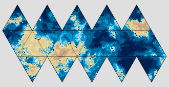
If that rings a bell with you, you have probably played Traveller!
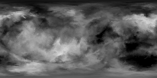
Generating a heightmap
Next, we want to create a heightmap. The generator gives you the
option to export a heightfield which stores the elevation at given
points as an integer using the -H flag.
However, I have never managed to make this format work with QGIS.
(This is not true anymore. I have since written a short Python script
that converts the -H flag output to
GeoTIFF. See the addendum of
2026-04-25) We will be generating a grayscale image instead using the
greyscale.col color map.
planet -s 0.10606208 -C greyscale.col -pq -w 7800 -h 3600 -o <filename>
Make sure you use all the same options (projection, size, non-linear scaling) as with your color map, otherwise, the will not align!
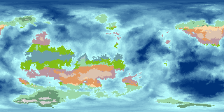
Generating a biomes map
The generator can automatically generate a false color map showing the biomes of our generated planet. It does so by estimating average temperature and precipitation based on latitude, altitude, and approximated rain shadow. Pretty neat.
To generate a biomes map, we use the -z flag. I tend to generate
biomes maps about one-fourth of the size of my color map, since I
rarely need the fidelity. To generate a biomes map for our seed, we call
planet -s 0.10606208 -z -pq -w 1800 -h 900 -o <filename>
Note that we do not provide a color map here. It defaults back to the
default color map to color the ocean. If we want a purely blue ocean
on our biomes map, we may use the 2col.col color map which colors
land uniformly green and sea uniformly blue:
planet -s 0.10606208 -z -C 2col.col -pq -w 1800 -h 900 -o <filename>
That’s it! Next step is to load everything into QGIS.
Excursus: Climate Simulation!?
While researching for this post, I came across an online Climate Simulator. The simulation readily accepts our bitmap heightfield!
While we can generate a biomes maps using our fractal planet generator, I thought this simulator is very cool! Especially if we want plan on having a hotter/colder planet, since the planet generator only creates biomes for an Earth-like planet.
QGIS
QGIS can be a bit intimidating if you have never worked with GIS software before. I will walk you through as best I can. If you want to learn more, there are plenty of good tutorials online with varying levels of complexity. I already mentioned Idraluna Archives. Klas Karlsson has made many in-depth tutorials for using QGIS as well.
Setting up the project
Let’s get going: Open up QGIS. Easy. But before we attempt to do
anything, we probably want to save our project somewhere. I named mine
tutorial.qgz and saved it to a dedicated directory.
We also want to set a different project CRS (Coordinate Reference
System). The default CRS, WGS84, uses Longitude and Latitude as
default x and y units which is a bit tricky for what we want to do. Go
to Project -> Project Properties and select the CRS tab. Search
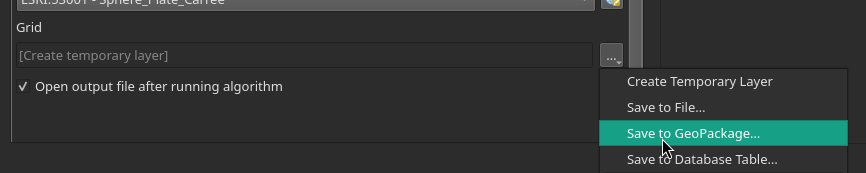
for the ESRI:53001 - Sphere_Plate_Carree CRS and set that as the
project CRS.
Importing the color map
Next, we want to import our color map, so we have a reference to work from. We cannot simply load the image into QGIS and expect it to know that our image is an equirectangular projection of a whole planet. We need to tell that to QGIS. The correct terminology is georeferencing.
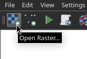
To import our color map open the Layer menu and select
Georeferencer. A new window will open. Select open raster and open
the color map. The map will show up in the previously white field.
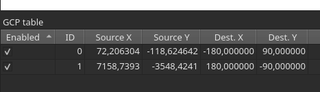
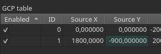
Now we need to relate coordinates in the image to coordinate points in
our coordinate reference system. Click once somewhere in the upper
left corner to create a first GCP (Ground Control Point). You do not
have to be precise here, as we can change the image coordinates of the
GCP later! A dialog opens asking you for the coordinates of this
point. Make sure WGS 84 is selected here since it works in Longitude
and Latitude and it is much easier to see what happens now in these
coordinates. The upper left corner of our map corresponds to 180°W
and 90°N, so enter -180 in the X / East field and 90 in the Y /
North field. Done! Repeat for the lower right corner, now entering
180 in the X / East field and -90 in the Y / North field. Your
GCP table in the bottom of the dialog should look something like this:
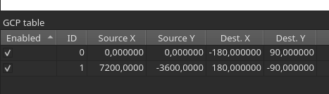
Now we can modify the Source X and Source Y columns to match the
actual upper left and lower right corners of the image. The image
coordinates of the upper left corner are x = 0 and y = 0; and the
image coordinates of the lower right corner are are x = 7200
and (somewhat unintuitively) y = -3600. Your GCP should look like this:
Next, we need to set some transformation settings.
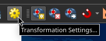
As we do not transform the image, we may also select Create world
file only. This way we do not create a new transformed raster
image. Make sure ESRI:53001 - Sphere_Plate_Carree is selected as
Target CRS. Click OK and close the dialog.
Now save the GCP to some file using C-s or File -> Save GCP Points as….
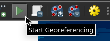
We don’t want to do this work again for the heightmap! Now click
Start Georeferencing, close the dialog, and we are done!
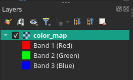
The color map should now appear in the Layers panel. If you do not
see the Layers panel, activate it under View -> Panels.
Importing the heightmap
Now we repeat the steps for our heightmap. Open the Georeferencer
from the Layer menu. Select Create world file only in the
transformation settings dialog and load the GCP points we saved
earlier using C-l or File -> Load GCP Points…. click
Start Georeferencing, close the dialog, and we are done already!
But wait. Our heightmap is a bitmap with 256 different grays. It is
also technically an RGB image (you can see three bands in the Layers
panel). We need to map the bitmap onto a true heightmap, for which
the values correspond to elevation. We do that using the Raster
Calculator… from the Raster menu. The raster calculator is a
powerful tool that allows us to manipulate all the pixels of a raster
image using a mathematical expression.
In the upper left corner of the Raster Calculator dialog you should
see a list of all Raster Bands in your current project. If everything
worked as expected so far, you should see three bands each for the
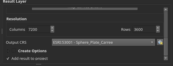
color map and the heightmap. Before we begin, we should set a name for
the Output layer in the Result Layer panel to the right. I choose
elevation.tif as name for the new layer. Leave the Output format
as GeoTIFF. Also, make sure the Output CRS is set to ESRI:53001 -
Sphere_Plate_Carree in the Result Layer panel of the dialog:
The greyscale.col color map stores the height as 255 different gray
values with the same red, green, and blue values. So we may pick any
of the bands to generate elevation values. I arbitrarily picked the red
band or heightmap@1. We now want to map the value of each
pixel to a value between a lowest elevation and a highest
elevation. Note that the generator assumes that <lowest elevation> = -
<highest elevation>. We may deviate from that, for example if we
wanted less water on our planet, but our generated color map would not
match anymore!
To map the grayscale pixel to elevation, we first shift the value of
each pixel to range between -126..129 by subtracting 126. This may
seem a bit arbitrary but has to do with the fact that the
Colombia.col color map does not exactly match the Greyscale.col map!
We then normalize the values to a range between 0..1 before we map
each pixel onto the range we want to cover. I decided I want a minimum
elevation of -8000m and a maximum elevation of +8000m. So I have
to multiply the values by 16000 This is the expression I entered into
the Raster Calculator Expression field:
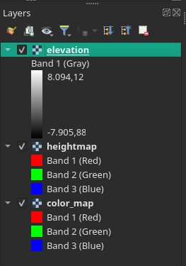
("heightmap@1" - 126)/255 * 16000
You Layers panel should look something like this:
So far, so good. We now want to style our data a little bit. We do
that by first dragging the color_map layer to the top of the
Layers panel. We then go to the layer properties dialog of the
color_map layer by right clicking on the layer in the Layers panel
and selecting Properties. In the properties dialog we select the
Symbology tab and set the Blending mode to Multiply:
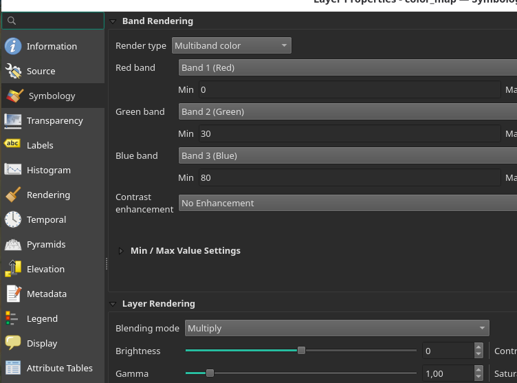
Click OK to close the dialog. The color map should now look a bit
darker in the main view screen. We next go to the properties dialog of
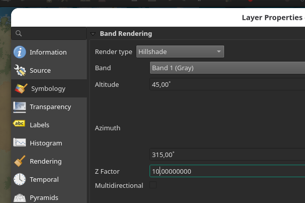
the elevation layer and on the Symbology tab we set the Render type
to Hillshade and the Z-Factor to 10.0 (this makes the effect
more pronounced):
Looks good so far, doesn’t it? Next step is to import the biomes map.
Importing the biomes map
Importing the biomes map is as easy as importing the color map and the
heightmap was. We can reuse the GCP points we saved earlier using
C-l or File -> Load GCP Points…. However, the source image for the
biomes map is much smaller! We need to adjust the Source X and
Source Y columns to match the lower right corner of our biomes map
to match the dimensions of the image (x = 1800 and y = -900):
Select Create world file only in the transformation settings dialog
and and click Start Georeferencing. Done!
We could work with the raster data to create our hex map. I want to go a slightly different route though which will give us a beautifully styled biomes map for our planet as a by product!
Excursus: Biome Colors
The biomes are coded in false color in the map generated by the planet generator. There is a legend in the manual. Here I provide a table with RGB values. As you can see, each biome has a unique red value. This will be useful later!
| R | G | B | Biome |
|---|---|---|---|
| 105 | 155 | 120 | Taiga / Boreal forest |
| 110 | 160 | 170 | Tropical rainforest |
| 130 | 190 | 25 | Tropical dry forest |
| 155 | 215 | 170 | Temperate forest |
| 170 | 195 | 200 | Temperate rainforest |
| 185 | 150 | 160 | Xeric shrubland and dry forest |
| 210 | 210 | 210 | Tundra |
| 220 | 195 | 175 | Desert |
| 225 | 155 | 100 | Savanna |
| 250 | 215 | 165 | Grasslands |
| 255 | 255 | 255 | Ice |
Creating a vector layer for biomes
Besides raster data, QGIS can work with vector data. A vector layer
comprises a number of polygons – called features in QGIS – which
have a number of fields stored in the Attribute table of the
layer.
You can draw features by hand. We want to create our biome features
using the raster to vector conversion, however. First, make sure your
Toolbox is open. You can open the Toolbox using the button or
pressing C-M-t.
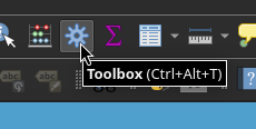
In the Toolbox, search for the Polygonize (Raster to Vector) tool and
click it to open the dialog. Select the biomes map as the Input
layer. Remember when I said that all biomes have a unique red value?
We use this to uniquely classify our biomes based on the red band of
the biomes map layer. Select Band 1 (Red) as the Band number. The
value is stored in a field with each feature we create. We want to
give that field a descriptive name. I called it
biome_value. Next, we want say QGIS where to save the vector layer
we are about to create. I makes sense to store all data we will
generate in the future into a single GeoPackage container. So click
Save to File…, name it data.gpkg. Creative, right? Click Run, and
we are done.
Next we open the properties dialog of our newly created vector layer
by right clicking on the data layer in the Layers panel and
selecting Properties. We want to change the name of the layer to
something more descriptive, for example Biomes. We can do so in the
Source tab of the properties dialog.
Every feature/biome has exactly one value attached to it. The
biome_value is the red value of the color that our planet generator
used. Not very descriptive going forward. We want to create a field
that stores the biome name for every feature/biome. We do that using
the Field Calculator:
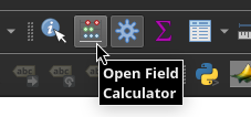
Make sure Create a new field is checked, set the Output field name
to biome_name and set the Output field type to Text (string). Next,
we need to write an expression that determines the value of our new
field based on the value of other fields. I have prepared an
expression based on the table I provided above. You’re welcome.
CASE
  WHEN "biome_value" = 0   THEN 'Ocean'
  WHEN "biome_value" = 105 THEN 'Taiga / Boreal forest'
  WHEN "biome_value" = 110 THEN 'Tropical rainforest'
  WHEN "biome_value" = 130 THEN 'Tropical dry forest'
  WHEN "biome_value" = 155 THEN 'Temperate forest'
  WHEN "biome_value" = 170 THEN 'Temperate rainforest'
  WHEN "biome_value" = 185 THEN 'Xeric shrubland and dry forest'
  WHEN "biome_value" = 210 THEN 'Tundra'
  WHEN "biome_value" = 220 THEN 'Desert'
  WHEN "biome_value" = 225 THEN 'Savanna'
  WHEN "biome_value" = 250 THEN 'Grasslands'
  WHEN "biome_value" = 255 THEN 'Ice'
END
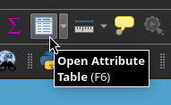
Click OK. If you check the Attribute Table now, every feature has
a new field called biome_name. Almost magic, huh?
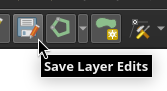
Do not forget to save the changes made to the layer every once in a while!
Next, we want to style the layer. Each feature/biome is shown in the
same color. That’s not very useful! Let us first change the styling
from Single Symbol to Categorized in the Symbology tab of the
properties dialog. This way, each category of feature is shown in its
own color, for example.
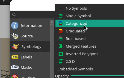
We now need to tell QGIS by which field to categorize the
features. Set the Value to biome_name. Next click Classify to
create a classification. By default, every category get its own unique
color which rarely looks pretty. I have written my own style which
looks somewhat naturalistic colors based off the colors used by
Thorf’s Hex Mapping Tools which
are itself based on the old BECMI Gazatteer style! You can find the
style file here:
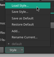
You can simply load and save styles you like using the Style menu in
the Symbology tab of the properties dialog:
Click OK and you’re done. Pretty cool, huh?
Making a local hex map
We now have a global topographic map, and a biomes map. Next we want to create a hex map for some interesting region. Browse around the map to see if anything looks interesting to you. There is an island chain starting above the Equator and going North around the Prime Meridian. That looks interesting to me.
Creating the grid
Once I find an interesting region, I typically create a layer called
Extent which comprises a single rectangle delimiting the region I
want to detail out. This will be useful later when we create a hex
grid, for example. To do so, create a new GeoPackage layer by pressing
C-S-n or selecting Layer -> Create Layer -> New GeoPackage layer…
from the menus to open the New Geopackage Layer dialog.
Select data.gpkg as the File name and Extent as the Table name.
Then select Polygon as the Geometry type. Click OK. QGIS will
now ask you whether you want to overwrite the file or create a new
layer for it. Select Add New Layer. Storing multiple layers in a
single container is the advantage of using a GeoPackage file.
Next, we select the Extent layer and move it to the top of the
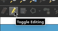
Layers panel. We then toggle editing
Now press C-. to add a new polygon. Now select the region you want
to detail by pressing left click to start and left click to
finish. QGIS asks you for a feature id (fid). Leave it at
Autogenerate and click OK. We now have defined our extent!
Next, search for Create Grid in the Toolbox panel and click on it
to start the dialog. Select Hexagon (Polygon) as the Grid type.
For Grid extent select Calculate from Layer and select the extent
layer we just created. Next, spacing. Hot button topic. I will go with
30 mile hexes for now. I can subdivide them later and manually add
more detail to them, for example using the method The Welsh
Piper
detailed on their blog. Anyway, enter your preferred spacing as
Horizontal spacing and Vertical spacing and do not forget to
change the units to Miles. In the field Grid where is says
[Create temporary layer] we want to select Save to GeoPackage… and
select our data.gpkg. QGIS will ask you a name for the new layer. I
choose Grid.
Click Run and we have a hex grid!
Next, we want to style the grid a little. Open the properties dialog
for the Grid layer and go to the Symbology tab. Select the
Simple Fill and change the Fill style to No brush. You can leave the
Stroke width as is. However, I like to set the width to a fixed value
in Meters at Scale. For a 30 Mile hex, I found that 1420 is a good value.
We have achieved representational hexes! If you don’t know what that means, see this blog post by Knight at the Opera.
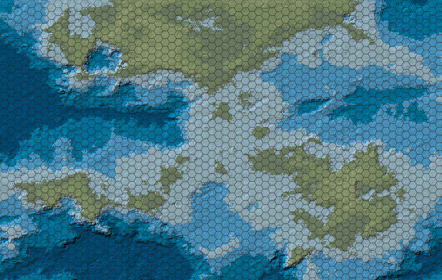
Here is what our region looks like:
Going Gazatteer Style!
My goal is, however, to create a map in the style of the BECMI Gazetteers. Thorfinn Tait has lovingly recreated all (?) of them. You can see them on their website Thorfinn Tait Cartography. They also created a number of templates to use with a comercial vector graphics tool: Thorf’s Hex Mapping Tools. You can open them in Inkscape just fine though.
I have extracted a number of hex templates for use with Alex
Schroeder’s text-mapper (see
the documentation of the Gazatteer style here) and provide a few here:


But before we can style our map like a BECMI Gazetteer, we have to
tell QGIS which hex is represents which biome. We do that using the
Join attributes by location tool from the Toolbox. We want to
Join the features in the Grid layer using By comparing to the
Biomes layer. As Join type select
Take attributes of the feature with largest overlap only (one-to-one)
Next we have to scroll down to field Joined layer [optional] where
is says [Create temporary layer] we want to select
Save to GeoPackage… and select our data.gpkg. QGIS will ask you a
name for the new layer. I choose Biome Hexes. Click Run and we
have a new layer!
The first thing we want to do now is change to a Categorized
style. Go to the Symbology tab of the properties dialog of the
Biome Hexes layer. Change the styling from Single Symbol to
Categorized and set the Value to biome_name. Next click Classify
to create a classification.
Now we have to set the style for each biome. Simply double click on
the Symbol you want to change to open the Symbol Selector dialog.
You can do this from the Symbology tab of the properties dialog or
from the Layers panel!
Ocean is easy. I choose to set it to a Simple fill with the color
#50a0cd. The Savanna grassland gets a Simple fill of #e6f59a.
Let us do something interesting next, how about the shrublands?. I
want to use steppe.svg as symbol. Change Simple fill to
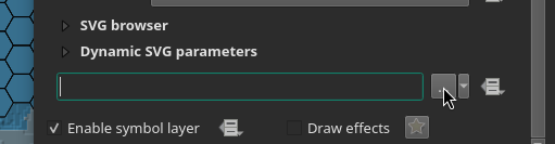
Centroid Fill and set the Simple Marker to SVG Marker. Scroll
down until you find the field where you can select the SVG you want to
use as marker:
Now set the height to the height of your hexes in meters with the
Meters at scale unit selected instead of Millimeters. For our 30
Mile hexes, the size is about 48280.3 m. Click OK and you have
successfully styled your first biome with a hex! Now we repeat this
process for the tropical dry forests I used
light_deciduous_forest.svg and for the temperate (wet) forest I used
heavy_deciduous_forest.svg.
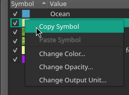
Note that in the Symbology tab of the properties dialog you can copy
styles from the context menu (right click on the symbol). You do not
have to enter the height again each time! Just copy the styles and
simply select a different SVG for each symbol.
The Grid is probably below the Biome Hexes layer. Just drag the
Grid layer above the Biome Hexes layer in the Layers panel to
see the grid again!
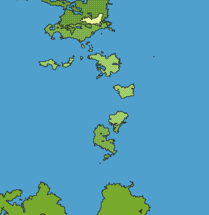
Here is what our region looks like:
Drawing the coastline
There is one last thing I want to do before I call this tutorial finished. Our coast looks very… hexagonal. I would love to see the original coast line somehow!
For that, we need a vector layer that tells us which parts of the map
are below 0 m. We do so by reclassifying our Elevation layer into
two classes, one below 0 m and one above. The tool we use is the
Reclassify by table tool from the Toolbox. In the dialog, select
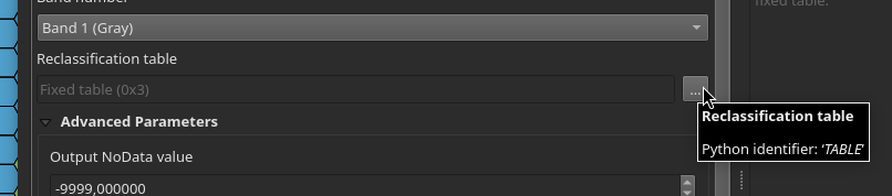
the elevation layer as Raster layer. Now open the
Reclassification table.
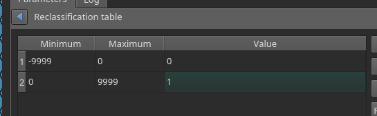
We want to to add two rows: One with a Minimum of -9999 and a
Maximum of 0, and another Minimum of 0 and a Maximum of
9999. We can set the value of the first to 0 and the value of
the second to 1:
We do not need to keep this layer and so we can use a temporary layer.
Next, we want to convert this layer into a vector layer using the
Polygonize (Raster to Vector) tool from the Toolbox. In the
dialog, set the Input layer to the reclassified raster layer we just
created. Let us set the Name of the field to create to Land. Hit
Run.
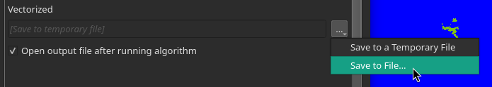
We probably want to make the temporary layer we just created
permanent. Select Make permanent… from the context menu of the
Vectorized layer we just created in the Layers panel. Select the
data.gpkg file we created earlier and Sea/Land and the Layer name.
Go to the Symbology tab of the properties dialog of the
Sea/Land layer. Change the styling from Single Symbol to
Categorized and set the Value to Land. Next click Classify
to create a classification. I set the sea features to a Simple fill
with the color #50a0cd and the land features to a Simple fill with
the color #96c864. We may also choose not to display the land
features at all. Simply unselect them or remove them in the
Symbology tab.
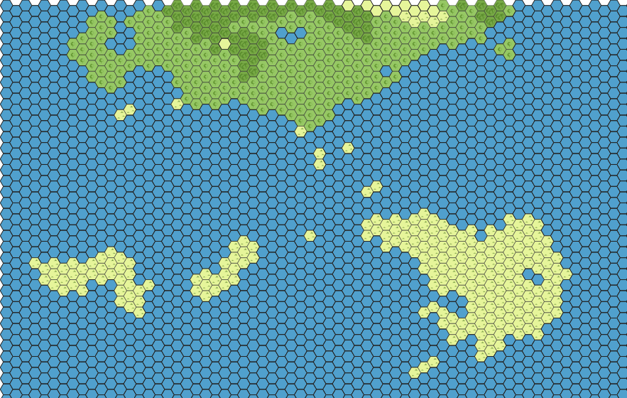
Here is what our region looks like:
Outlook
We have barely scratched the surface of what is possible using
QGIS. For example, we have not yet used the information provided by
the Elevation to style the hexes. We may style hexes with an average
altitude above a certain threshold value as mountains. To determine
the average altitude we may use the Zonal statistics tool. But that
is beyond the scope of this tutorial. But I may revisit this topic in
the future.
If you want to learn more about making hex maps using QGIS, I refer you to Idraluna Archives.
If you want to detail one or more of the 30 Mile hexes we just generated, I suggest you take a look at the procedure The Welsh Piper details in his Hex-based Campaign Design (Part 1) post.
I’d love to hear you feedback!
2026-04-22 Addendum
I have provided exemplary maps. What an oversight! Thanks to ~lkh for pointing this out to me.
You can export maps to images or PDF from the Project -> Import/Export
menu. By default, QGIS exports the current view. I prefer to use the
Extent layer to define the region to export. In the export dialog
select Layer next to where is says Calculate from and select the
Extent layer. Easy!
2026-04-25 Addendum
I found a way to convert the heighmap output of the -H flag to
GeoTIFF using the rasterio
library based of a
gist
by Philipp Kraft
The target_range defines the difference between the minimum value
and the maximum value in the resulting heightmap.tif. The script
maps the integer values in the heightfield.xyz as floating point
values onto the target_range. TheCRS of the resulting
heightmap.tif is in WGS84.
Not sure numpy is needed here. But it works.
import numpy as np
import rasterio as rio

CRS="EPSG:4326"
f_in = "heightfield.xyz"
f_out = "heightmap.tif"
target_range = 16000

f = open(f_in, "r")
array = []
for line in f:
    array.append(list(map(int, line.rstrip(" \n").split(" "))))
f.close()

np_array = np.array(array, dtype=float)
np_array = np_array / (np.max(np_array) - np.min(np_array)) * target_range

transform = rio.transform.from_bounds(
    west = -180.0, south = -90.0,
    east = 180.0, north = 90.0,
    width = np_array.shape[1],
    height = np_array.shape[0]
)

with rio.open(
    f_out, 'w',
    driver = 'GTiff',
    height = np_array.shape[0], width = np_array.shape[1],
    count = 1, dtype = str(np_array.dtype),
    crs = CRS, transform = transform, compress = 'lzw'
) as raster:
    raster.write(np_array, 1)
You can find the documentation of rasterio
here.
Links
- QGIS
- Azgaar’s Fantasy Map Generator
- Lemuria Games – Fantasy Map Tutorial (on YouTube)
- Idraluna Archives – A Tutorial for Making Hexcrawl Maps in QGIS
- Idraluna Archives – Mapping Fantasy Antarctica
- Torben Æ. Mogensen’s Planet Generator
- donjon
- cpt-city
- xkcd – Map Projections
- G.Projector
- Traveller
- Wikipedia – GeoTIFF
- Wikipedia – Biome
- Space Calc – Climate Simulator
- Klas Karlsson (on YouTube)
- Thorf’s Hex Mapping Tools
- The Welsh Piper – Hex-based Campaign Design (Part 1)
- A Knight at the Opera – How Do You Handle the “Inside” of a Hex?
- TSR Archives – BECMI Gazetteers
- Thorfinn Tait Cartography
- Inkscape
- Alex Schroeder’s text-mapper
- The Gazatteer style for text-mapper
- Convert .xyz elevation models to GeoTiff (on GitHub)
- Philipp Kraft
- rasterio
Comments? Send me a mail to agroschim [at] grenzland [dot] club.